Launching the world’s longest all-weather slope on the world’s shortest timeline.

On the edge.
Our Challenge
New technology.
Since an artificial slope was new to Iowa, we helped conduct two focus groups to understand potential visitors’ questions. We discovered that while most people were eager to hit the slope, several wanted details about the surface and how it worked. Clearly, the brand needed to be both fun and smart. No problem.
Our Solution
New insights.
Our BrandMining™ Workshop uncovered additional insights and, when combined with research, helped our brand platform set Sleepy Hollow apart. The brand essence “Everyday Adventure” conveyed how easy it was to experience outdoor fun. And the brand position, “All-weather. All fun.” reminded visitors they could chill (or not chill) year-round.
Logo
Carving out a niche.
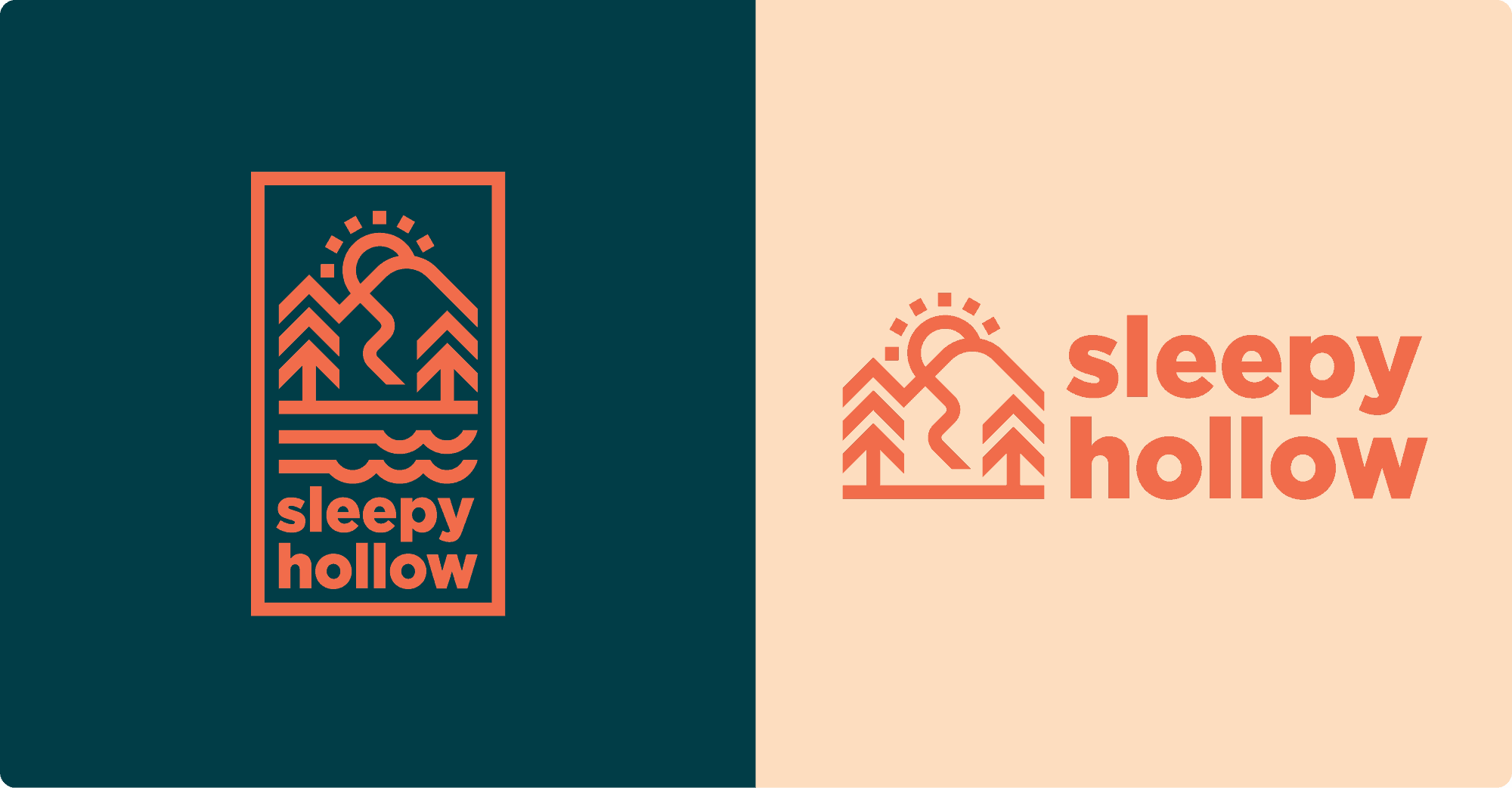
The Sleepy Hollow logo embodies the spirit of everyday adventure with its simple, playful style. And the weight of each letter gives the mark boldness while remaining friendly and welcoming. Who’s sleepy now?
Brand palette
Warm colors, cool look.
The dynamic color palette strikes the perfect balance between muted earthy green and tan tones representing the natural world, and dynamic orange to complement featured action imagery. The contrast brings a youthful, energetic, and warm feel to the exhilarating brand. Let’s ride!

Graphic Elements
Meet our team.
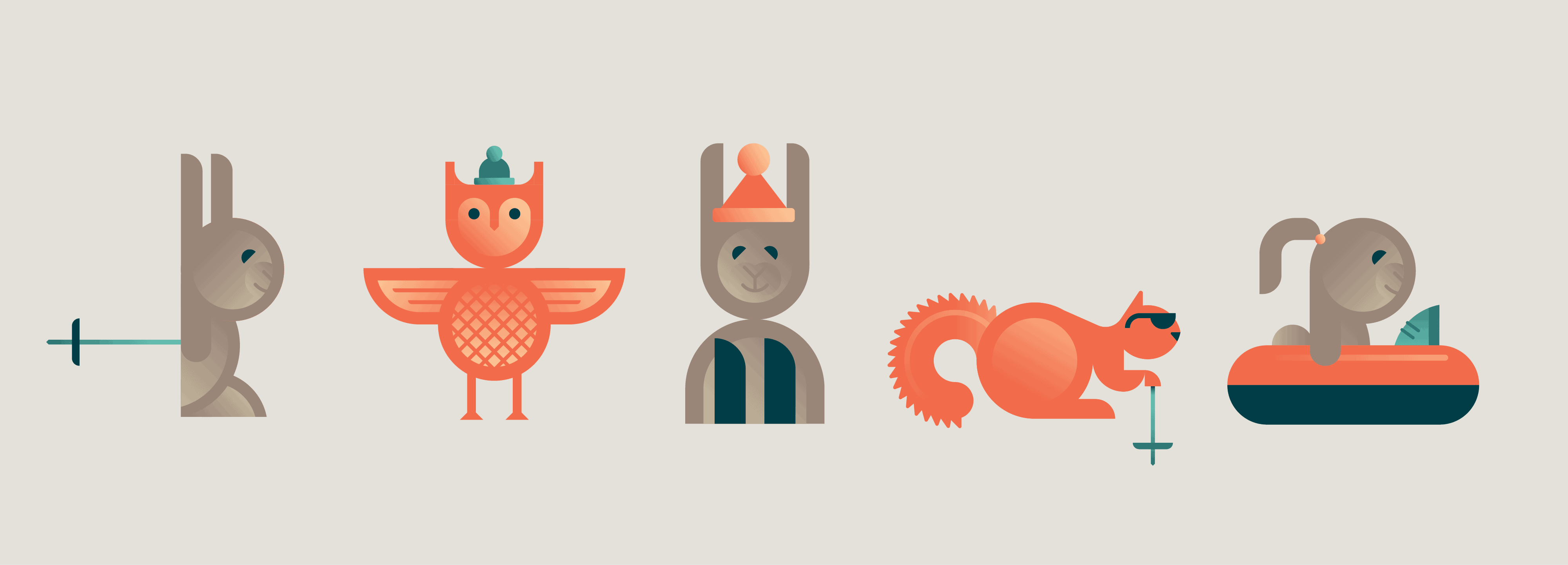
Sleepy Hollow’s team of woodland creatures welcomes visitors to the world’s longest all-weather slope. This adventurous group of fun-loving animals is always down for going downhill. A wise owl shares information about how to stay safe. A skiing squirrel talks about year-round fun. And a family of bunnies welcomes friends of all ages to join in.
Iconography
Iconic elements.
Based on focus group findings, future visitors to the park were excited but cautious about the new slope. We developed a simple, friendly, and informative set of icons to ensure that people could find the information they were looking for easily and quickly. All so they could spend more time making memories with family and friends.
Website
Ticket to thrill.
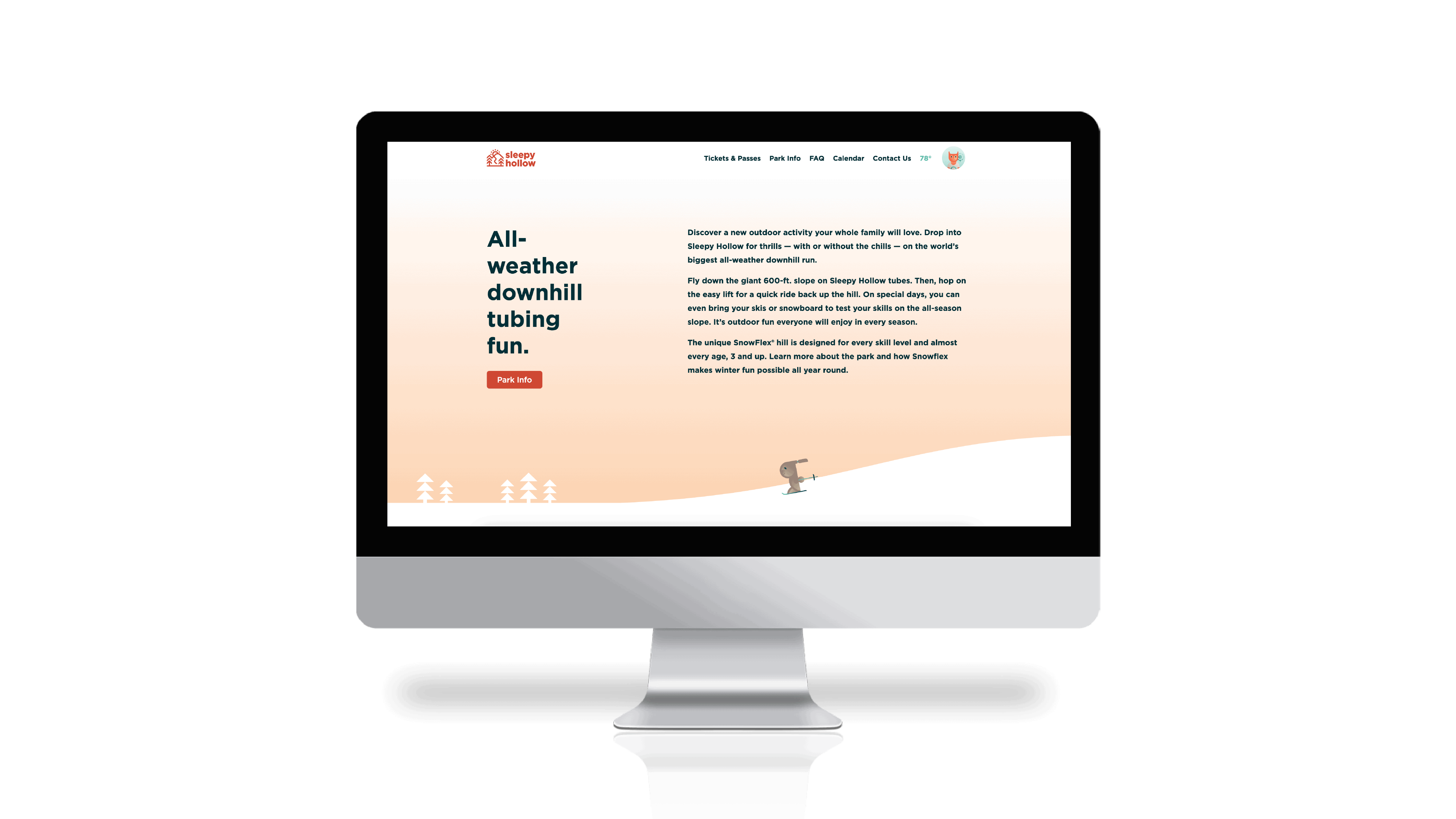
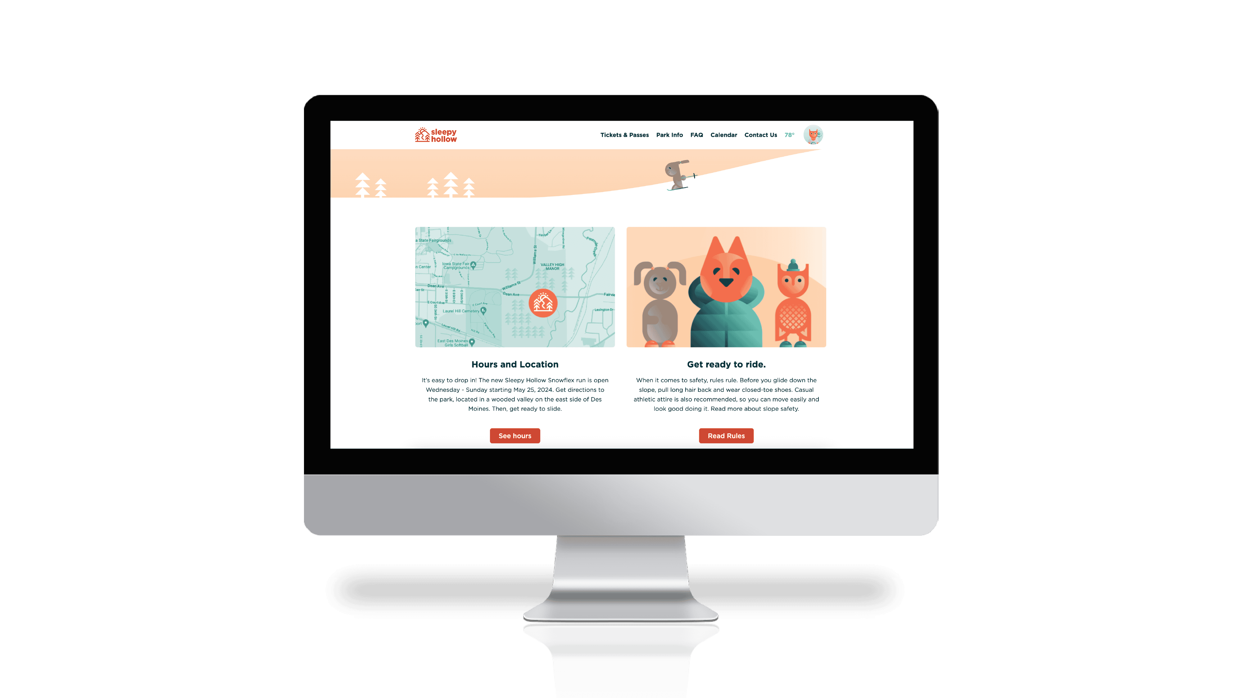
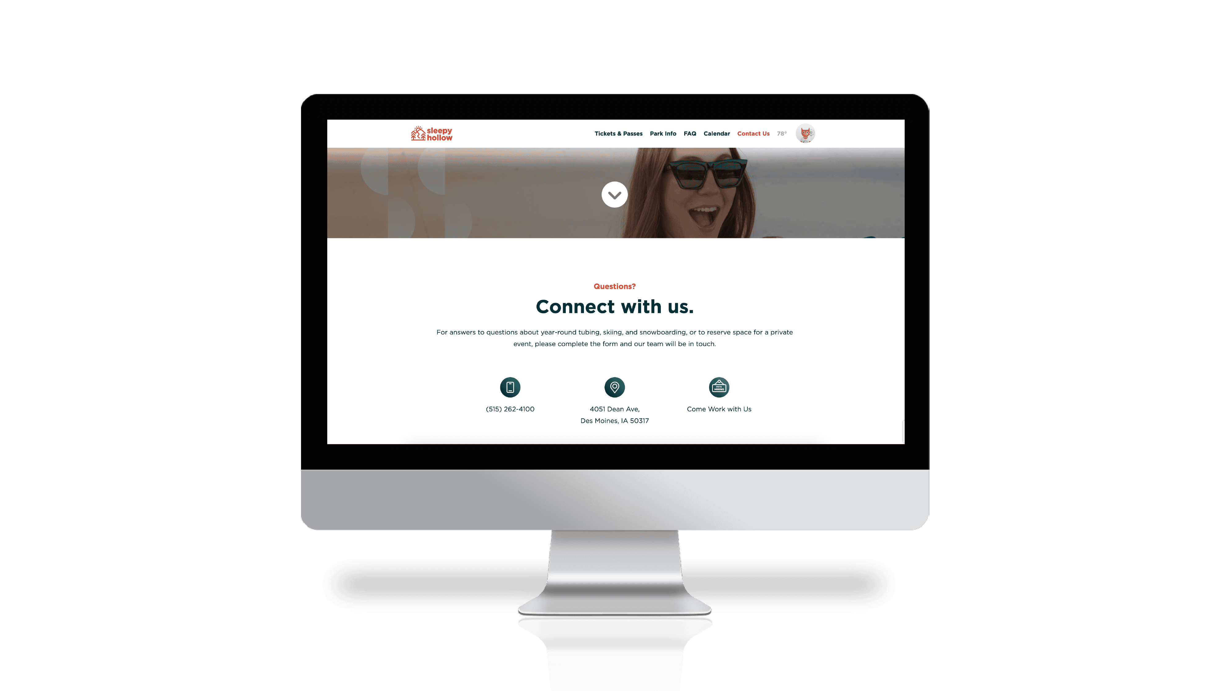
Directing people to buy tickets and reserve hill time is the primary goal for the e-commerce website. We wrote and designed it accordingly, and optimized the site to be ADA compliant, ensuring that everyone feels welcome. We also made sure to address visitors’ questions and concerns by building a comprehensive FAQ section.
Wearables
All-weather gear.
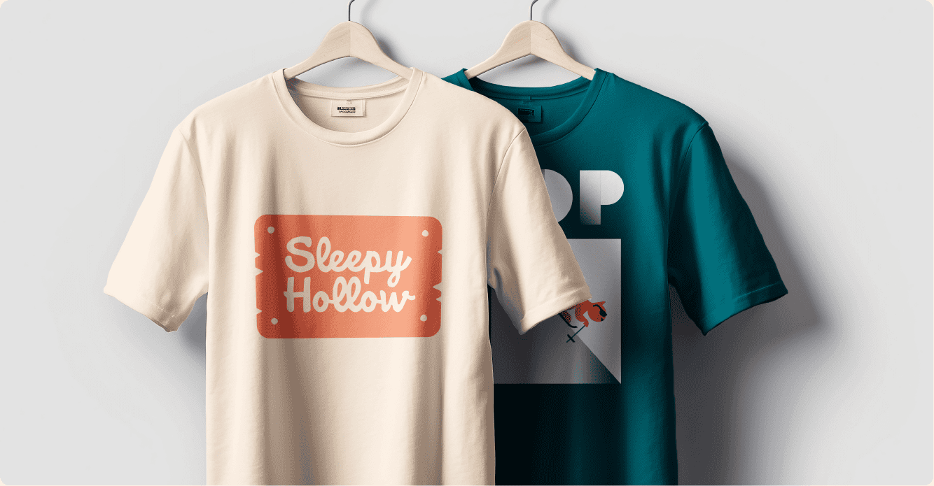
Because Sleepy Hollow is open year-round, they needed year-round clothing options for tubers, skiers, and snowboarders. So, we happily turned out t-shirts, hats, sweatshirts, and more that’ll look sweet on or off the slope.
Campaign
New brand just dropped.
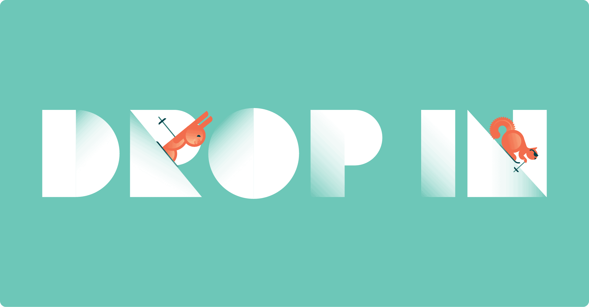
There’s nothing like the feeling of dropping into a big slope. There’s also nothing like the feeling of not having to plan a big trip to do so. The brand campaign for Sleepy Hollow, “Drop In”, drives both of those points home quickly and easily. It reminds people they can easily drop into the park any day and any season for downhill fun. Now, drop everything and let’s go.
