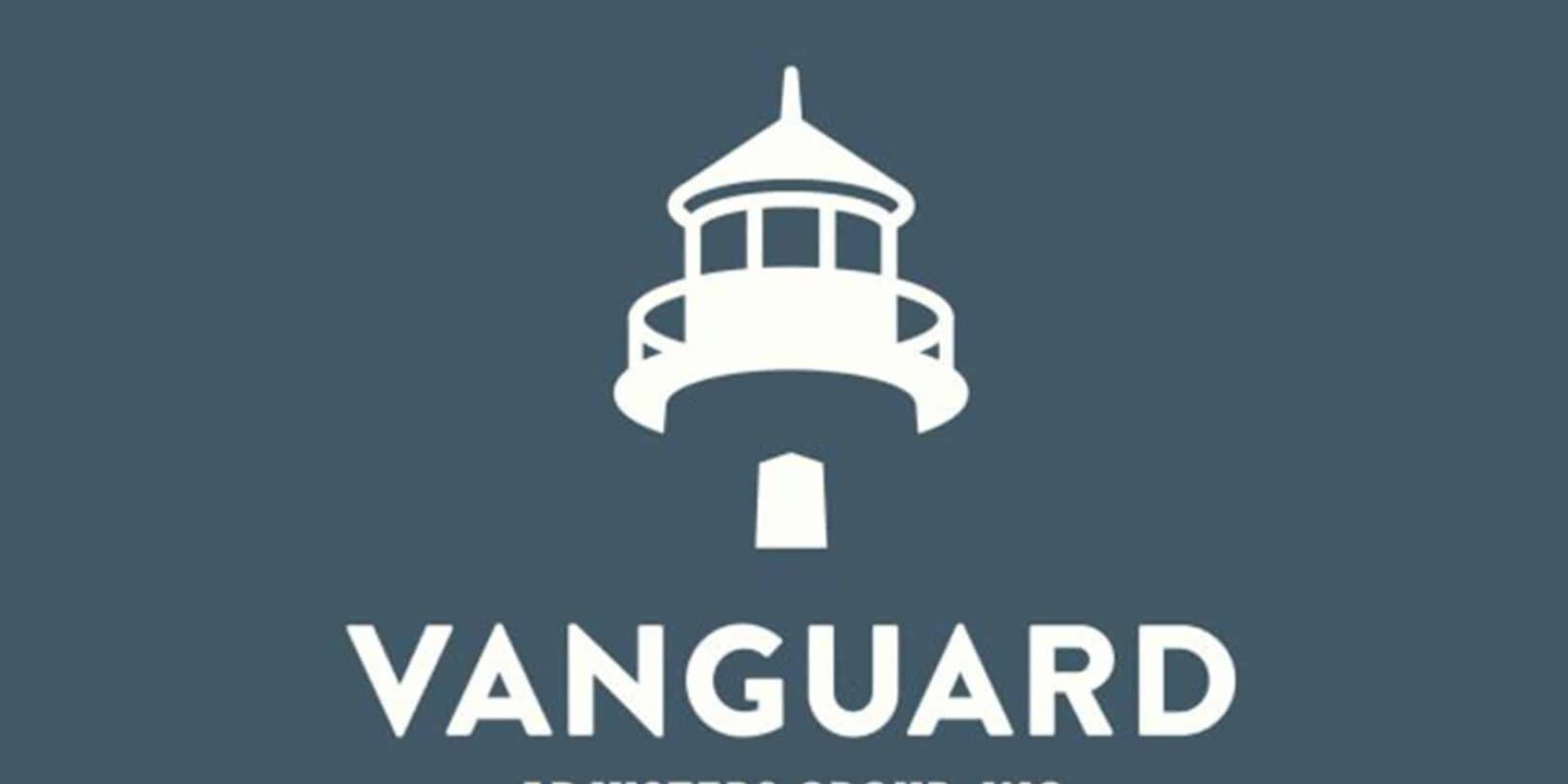
Vanguard
April 10, 2017
| Red Dot | Branding
After several major storms hit the Eastern Seaboard in recent years, Vanguard grew quickly, thanks to their exceptional claims service. We thought their brand identity and logo could use the same level of care, too.
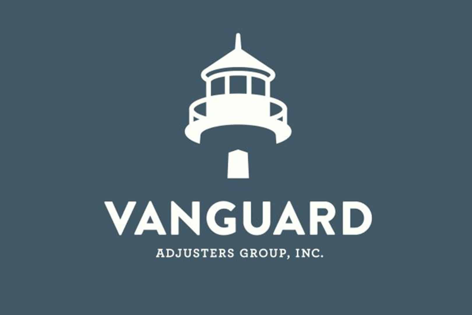
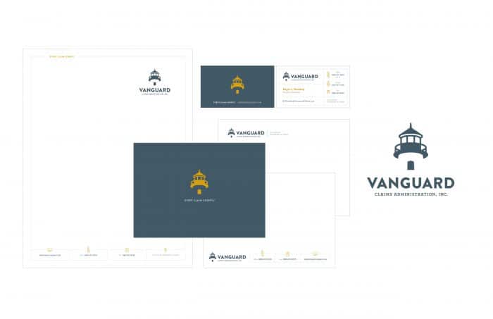
The lighthouse icon was retained, as it ties to a primary partner in England and symbolizes the guidance that customers receive. However, the new logo we developed conveyed so much more: growth, strength, simplicity and vitality, just to name a few characteristics. And it successfully positioned Vanguard as a modern and efficient company. Just another shining example of how a refreshed brand can make a positive impact.