Building an inclusive brand around the nation’s most accessible park.

You’re welcome here.
Our Challenge
Ears to the ground.
Research uncovered insights from parents and caregivers of those with cognitive and physical differences. They told us they didn’t want a park just for them—they wanted a park for everyone, where all friends and family members could discover nature together. So how do you brand an inclusive park without calling it that?
Our Solution
A park for all people.
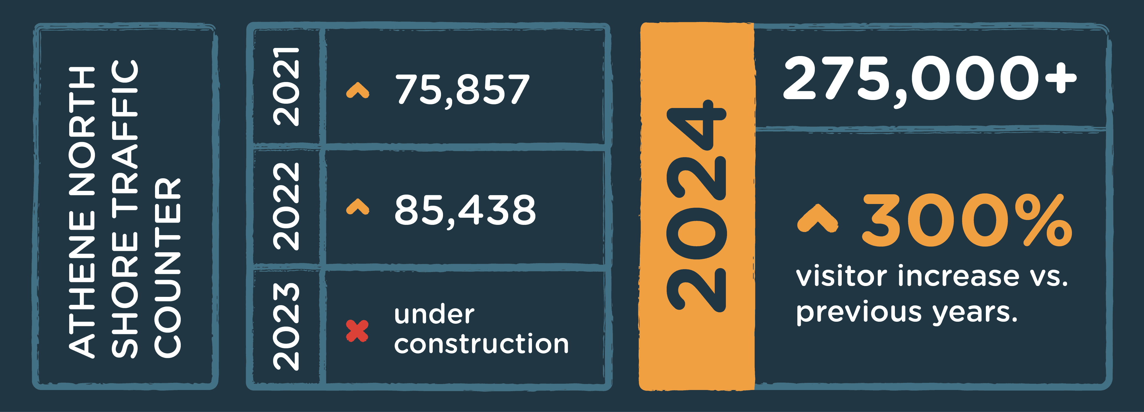
We jumped into the deep end and developed a brand platform based on “Pure Joy” that positioned the space as a park for all people, giving stakeholders a common language to talk about the park to media, caregivers, and visitors. In just the first two months, park traffic was up 49,856 visits from the previous year and roughly 250 individuals with physical or cognitive abilities were served.
Brand Elements/Logo
Imperfectly perfect.
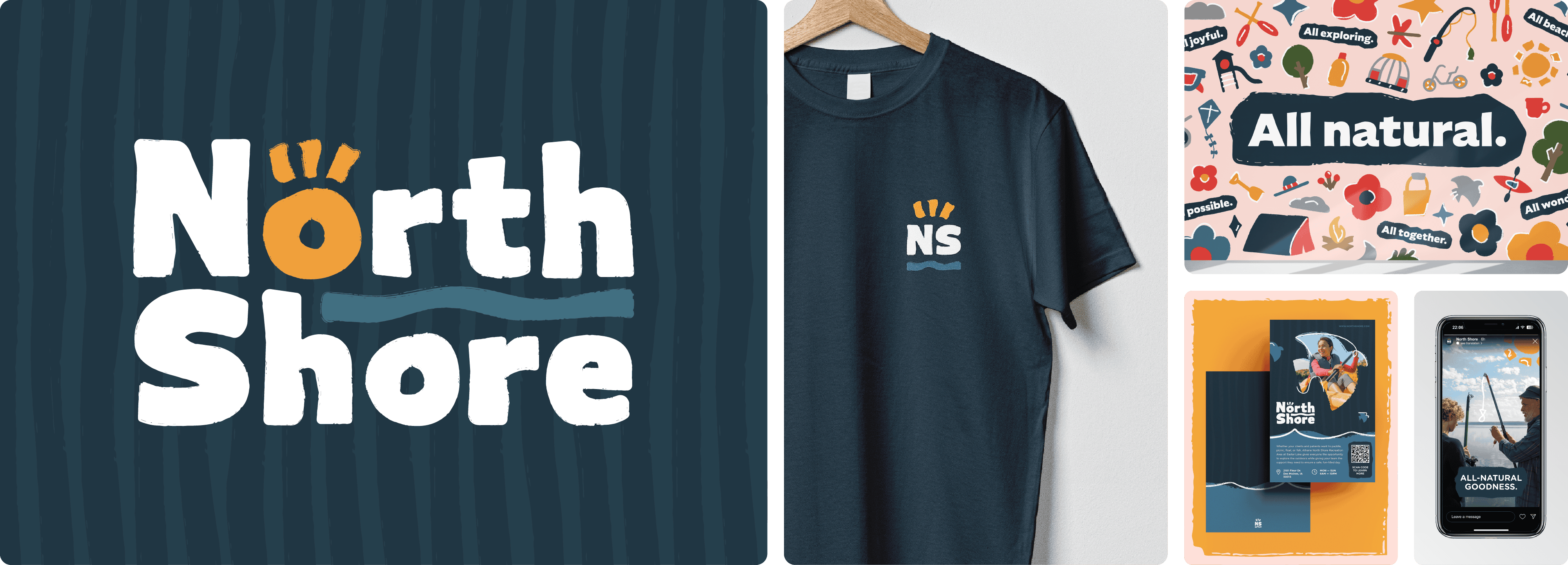
Organic and imperfect, brand elements that include the park logo feel playful, simple, and welcoming. Incorporating a major corporate supporter while ensuring the fonts and sizes were ADA-compliant on signage, materials, and the website was a challenge we solved in a beautifully natural way.
Brand palette
Colorful discoveries.
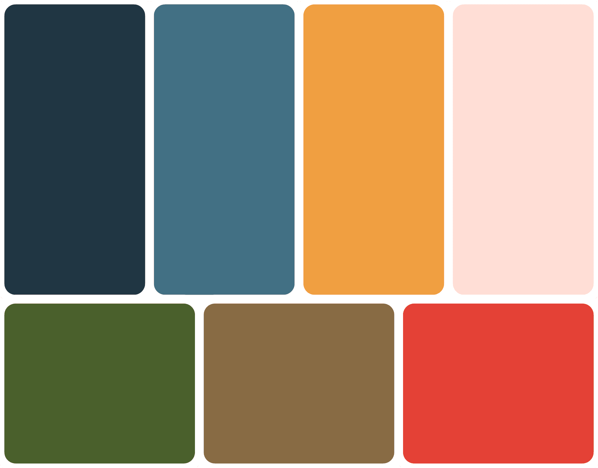
North Shore’s primary palette features dynamic contrasting colors, with blue conveying calmness and stability and orange feeling warm and energetic. The secondary palette provides flexibility across messages and platforms.
Fonts
Exploring fonts.
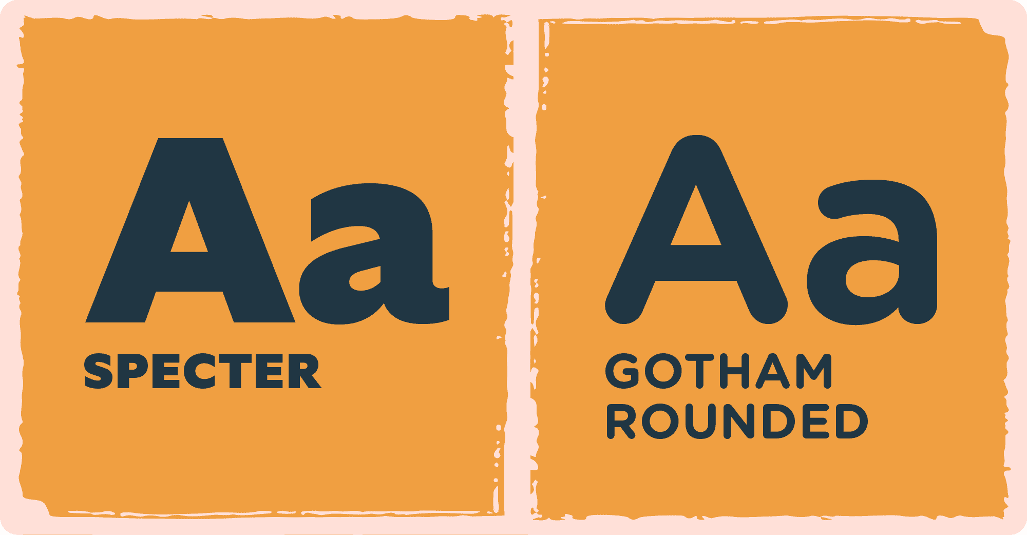
The foundation of the brand is built on both custom and standard fonts. Gotham Rounded serves as the primary sans-serif font to enhance readability for those with low visual acuity. The custom font is based on Spector Bold to reflect the brand’s all-natural, organic essence.
Iconography
Playful icons.
A natural hand-drawn look enhanced by textures and accent strokes makes the North Shore icon set feel approachable and joyful—right on brand. The iconography also serves as an informative guide around the park for those with varying cognitive and physical abilities.
Website
Digital made natural.
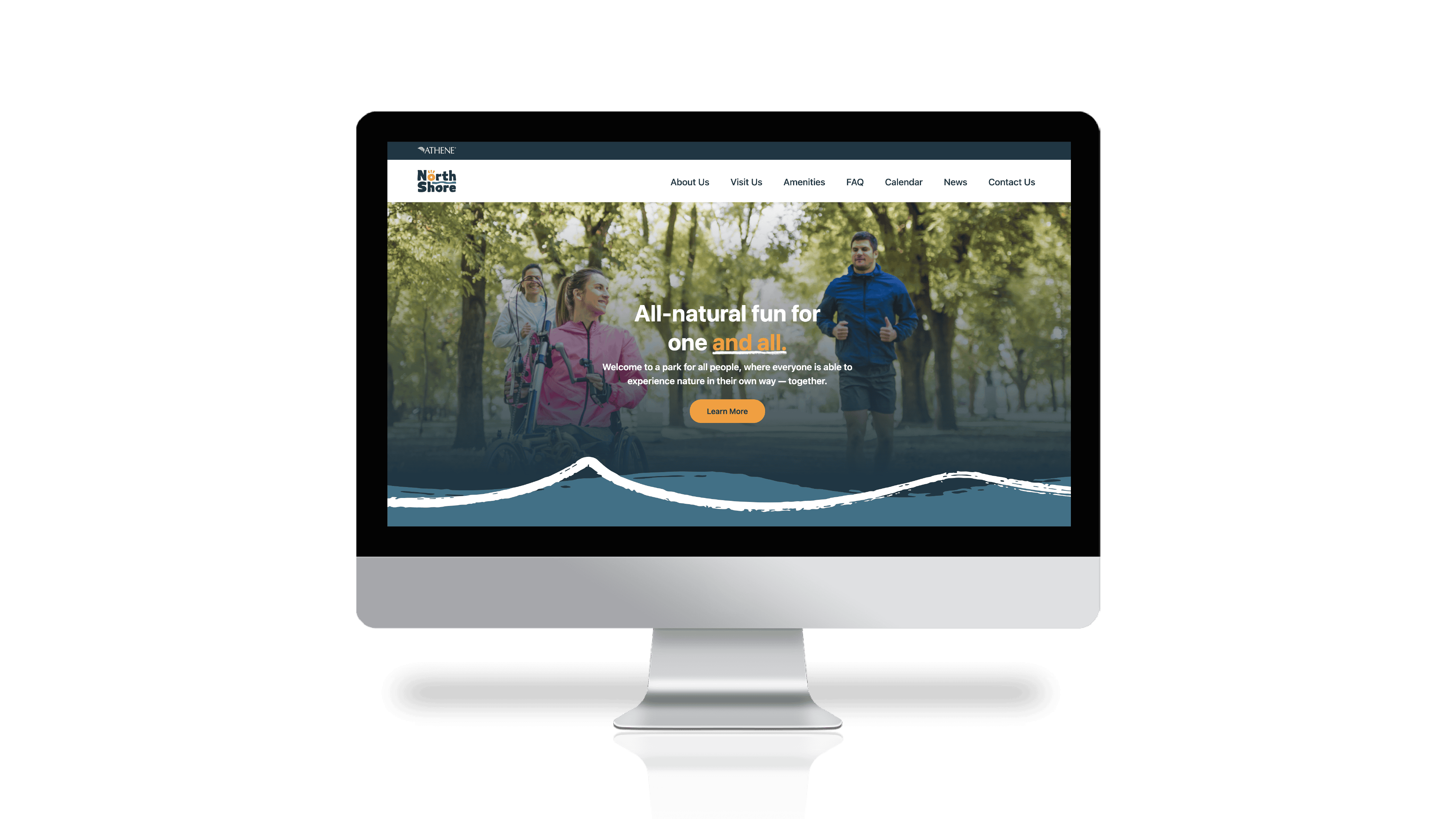
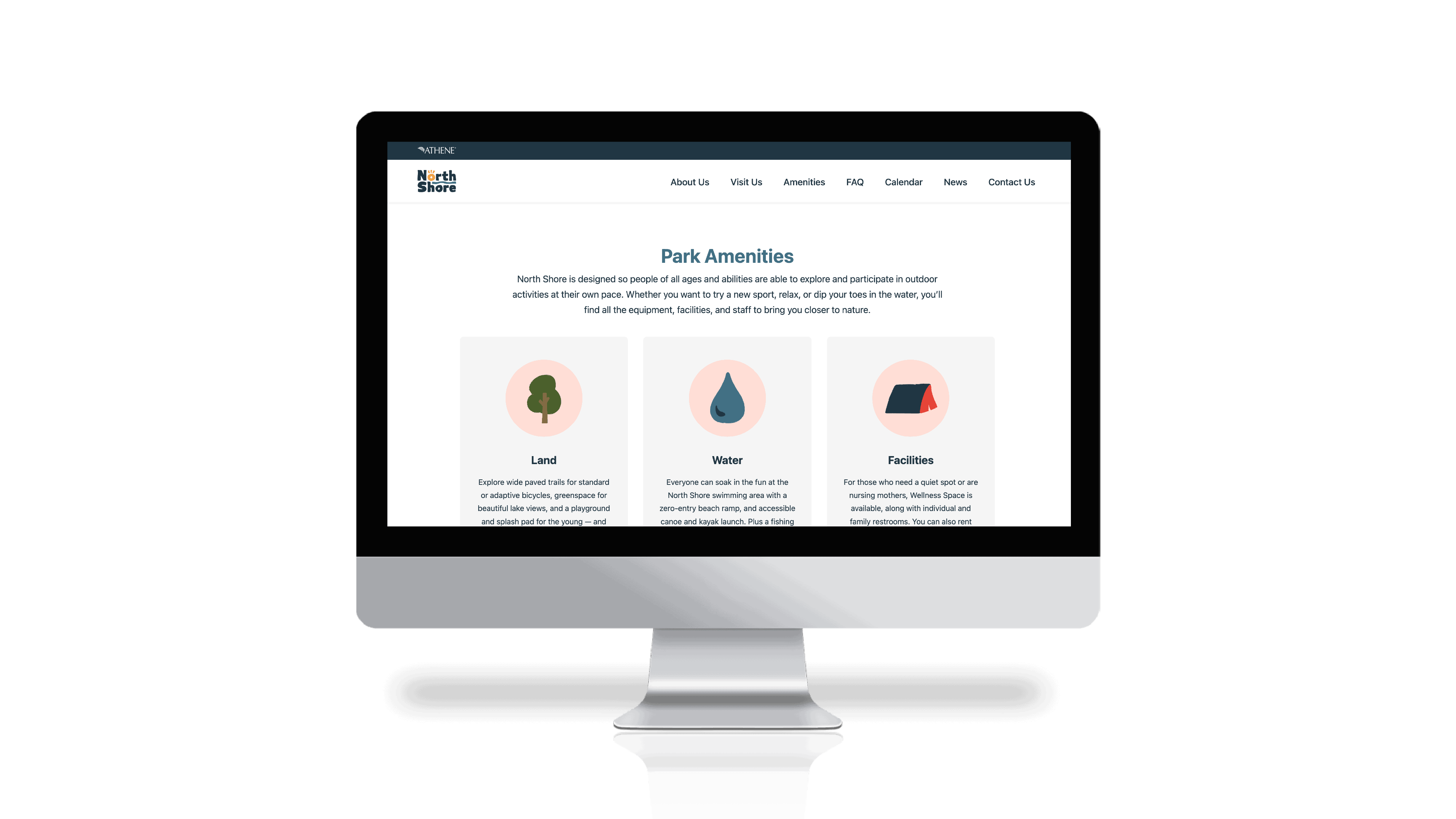
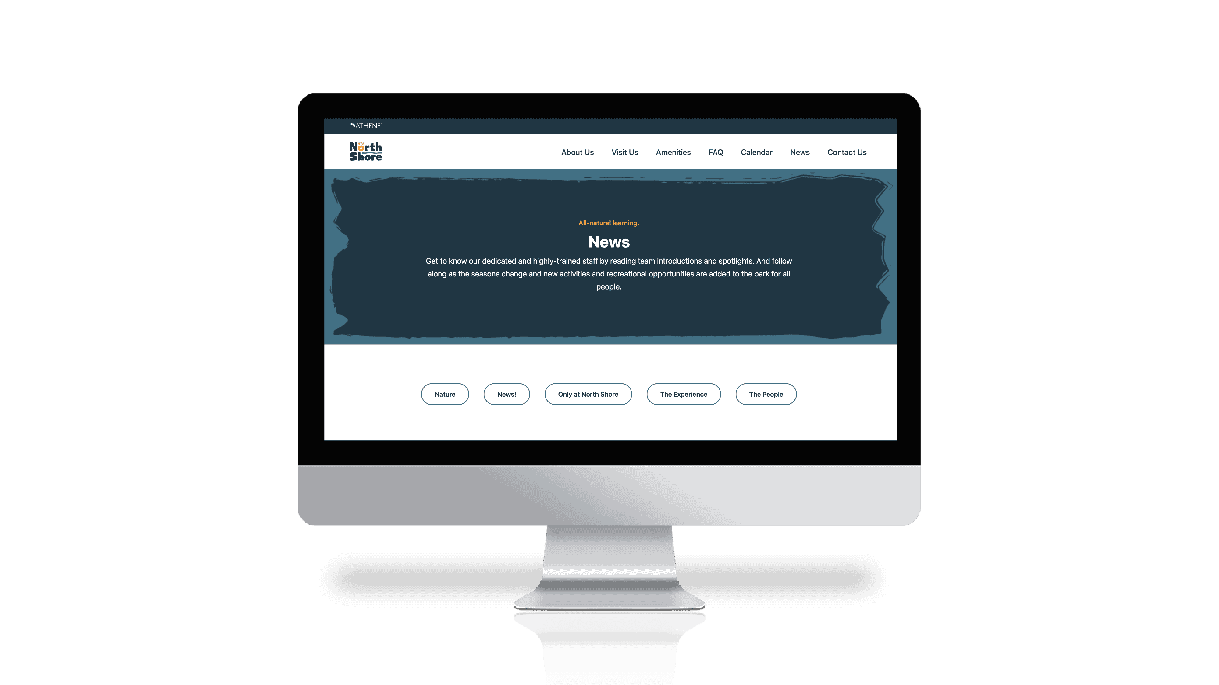
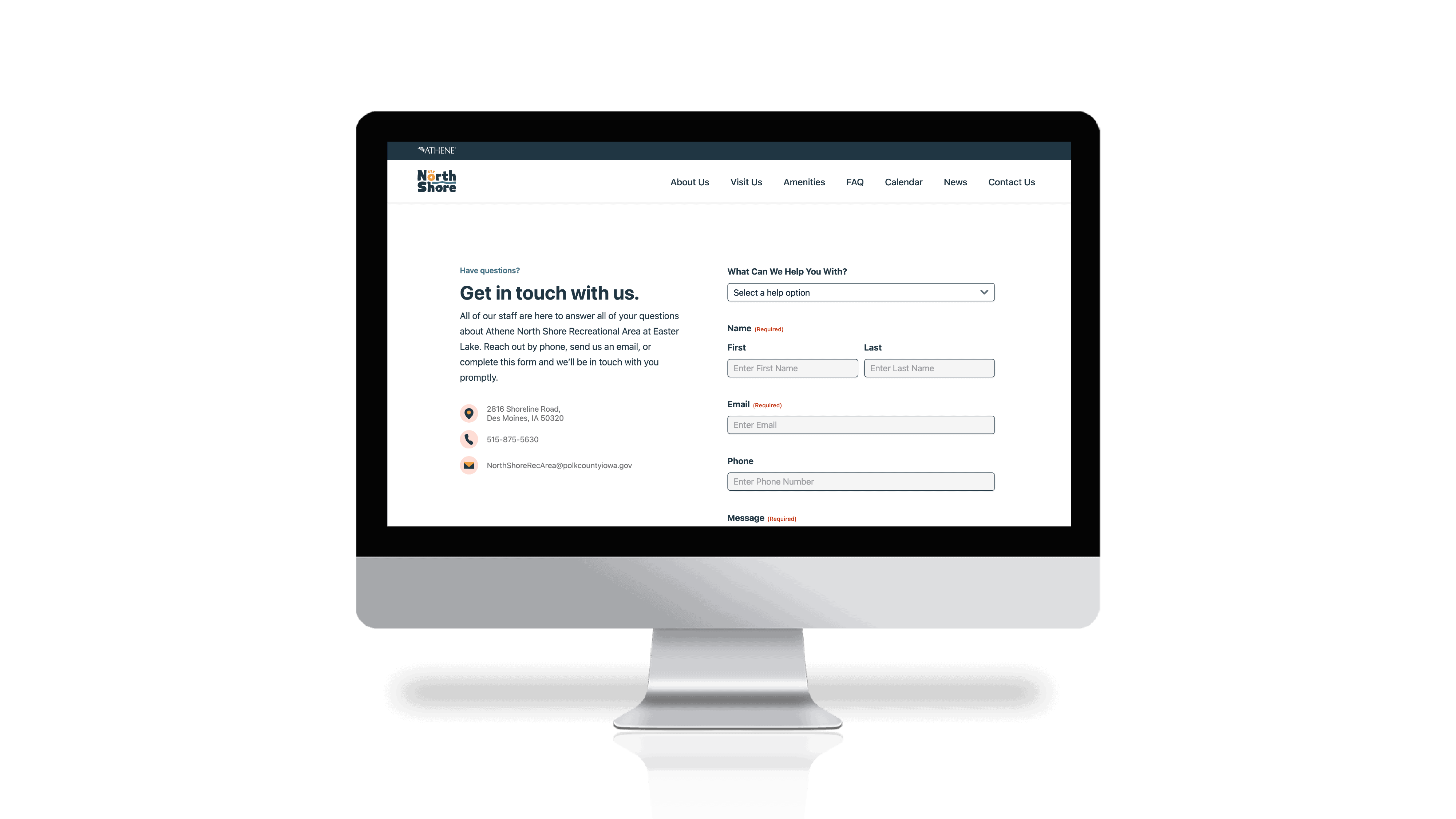
The park’s brand campaign “All natural fun for one and all” launched on a website built to achieve ADA compliance. It features detailed information for those who need to plan well in advance. It also educates potential visitors on all of the activities available, where to park, how to get around, and more. All so families and friends can focus on enjoying their day—together.
Success
All good results.
In just the first two months of operation, park traffic was up 49,856 visits based on the same period in 2022. From May 1 – June 30 of this year, roughly 250 individuals with physical or cognitive disabilities have been served from organizations including the VA, Paralyzed Veterans of America, Adaptive Sports Iowa, On With Life, Mosaic, The Spina Bifida Association of Iowa, and Broadlawns.
