Bringing outdoor initiatives, marks, and parks under one brand roof.

Parks with purpose.
Our Challenge
Exploring challenges.
Since PCC was created in 1956, the organization has built programs and parks to serve a variety of audiences. The result was a wild array of logos, colors, and fonts. Red Dot was asked to provide a cohesive brand to house their family of sub-brands seamlessly—one that could be executed easily by their team to protect taxpayer dollars.
Our Solution
Forging a new trail.
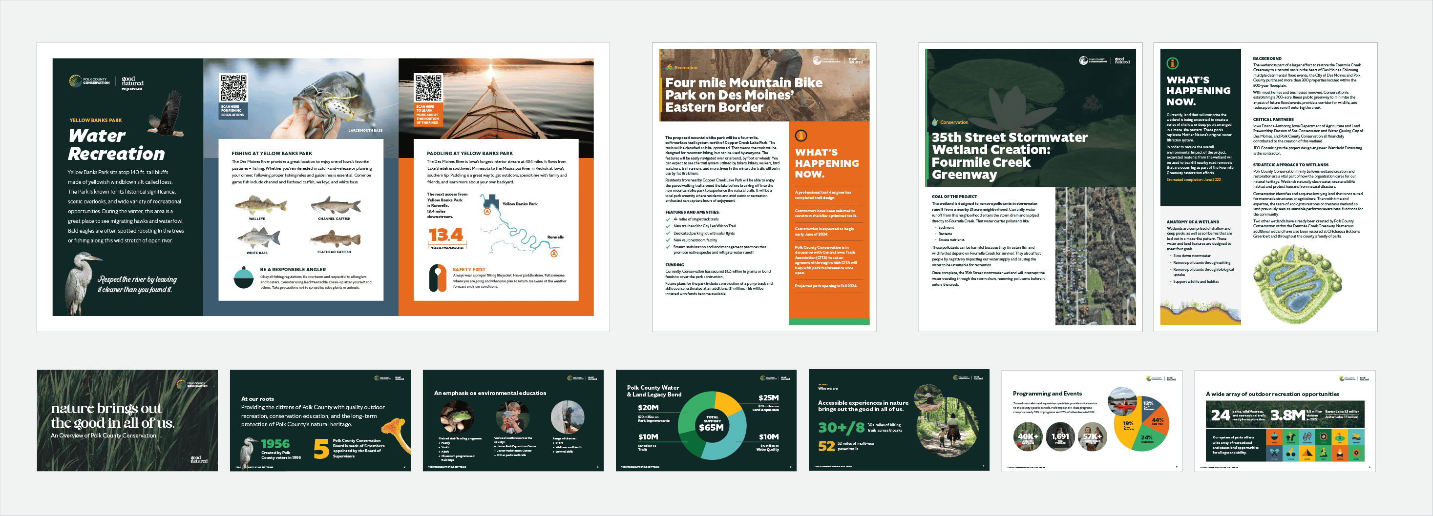
Red Dot’s Brand Mining Workshop and platform positioned PCC as a force for nature—one that resourcefully dedicates itself to the land, water, and wildlife and always puts nature first. With that in mind, we created wearables, social posts, fact sheet templates, educational signage, and more that their team could execute beautifully. What a wonderful world.
Brand architecture
The brand blossoms.
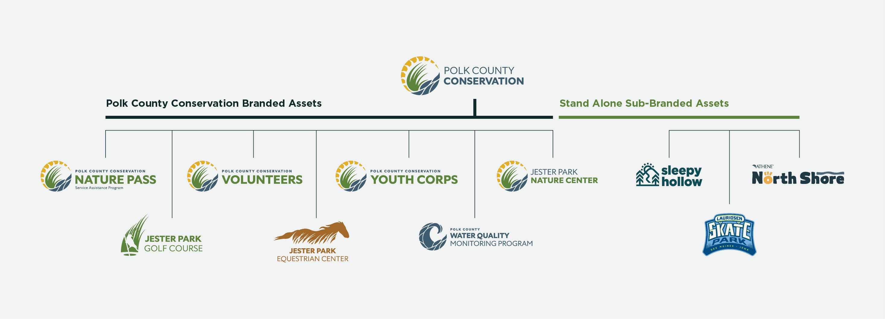
First, we developed a simplified brand architecture to pull together numerous logos under the PCC umbrella. Every logo, including the master PCC mark, was simplified and united with a color palette and font system. Separate identities remain for parks PCC manages that are sub-branded to clearly delineate the families.
Brand logo
A wordmark full of life.
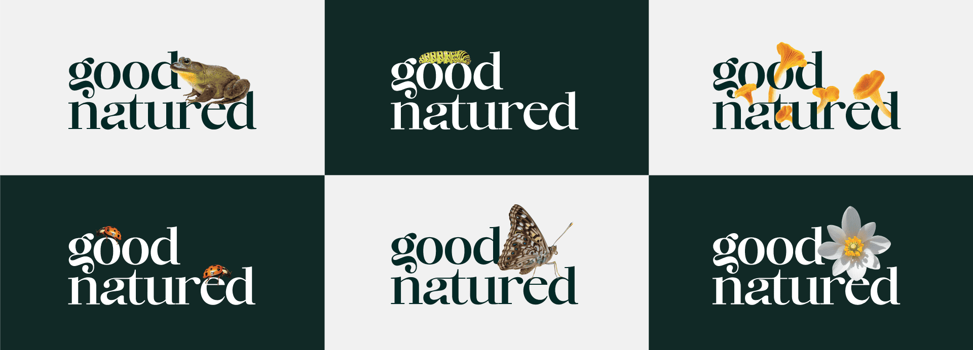
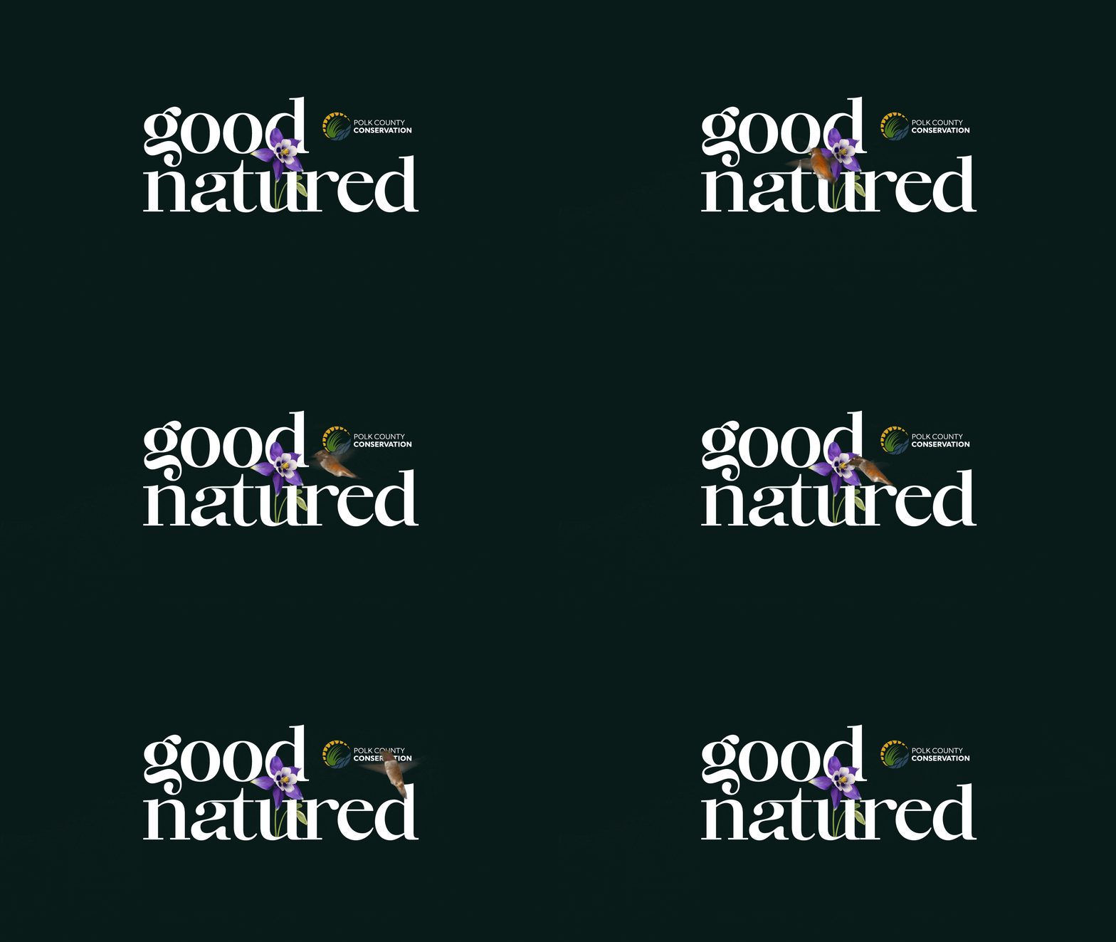
Artful and engaging, the handcrafted “good natured” wordmark not only reminds audiences of the mission of the organization—it perfectly blends natural elements like insects, plants, and animals into the typography, which feels both playful and meaningful.
Brand logo
Brand Palette
A breath of fresh air.
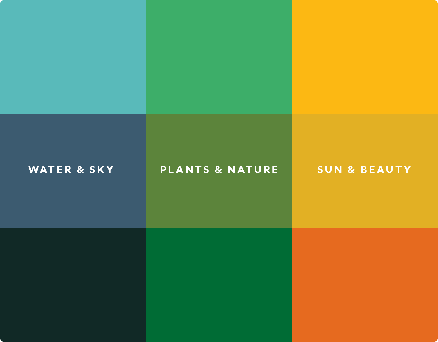
The brand color palette is based on colors found in the natural world—water, plants, wildlife, and sky. The primary palette is saturated and rich while the secondary palette is bright and vibrant, providing balance and flexibility in design.
Graphic Elements
Elements of design.
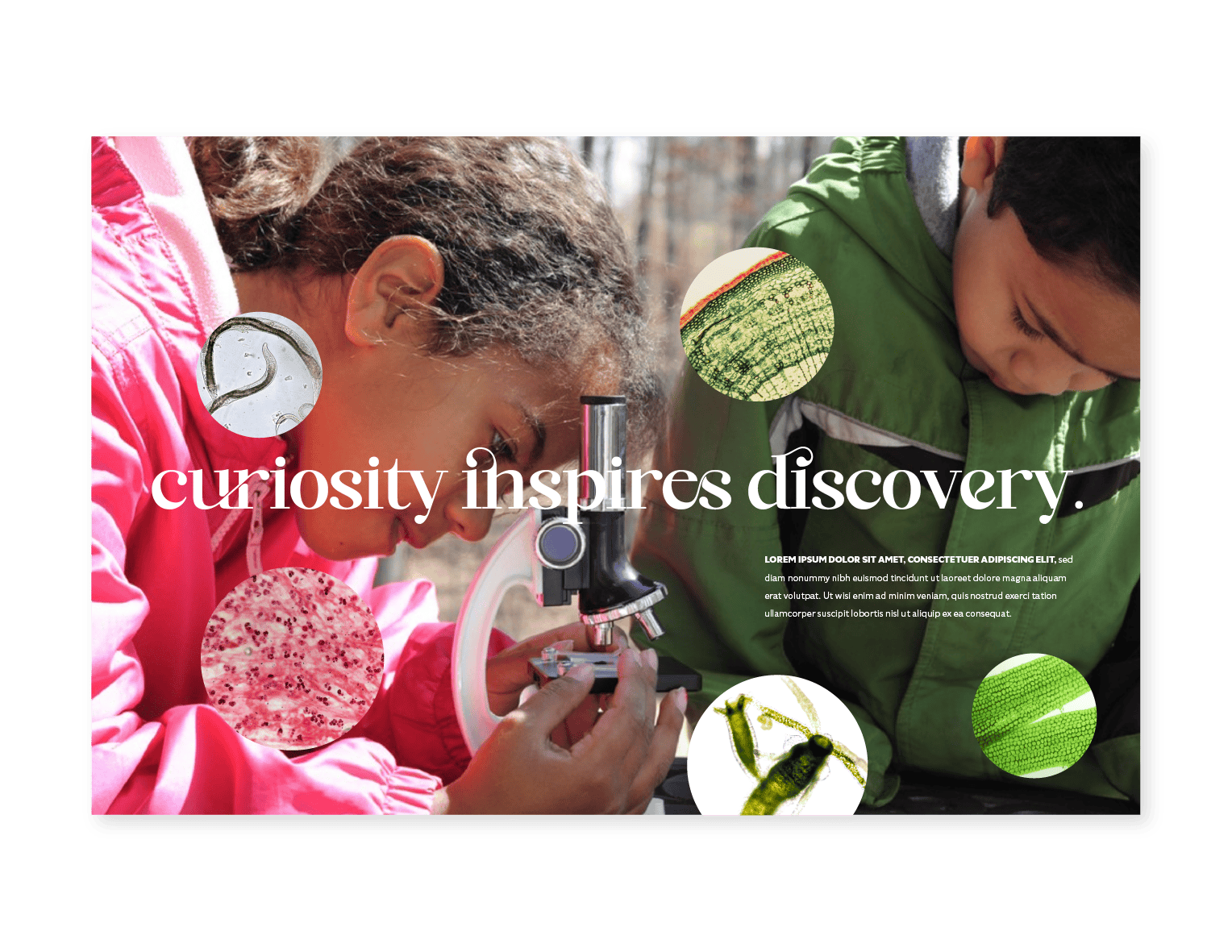
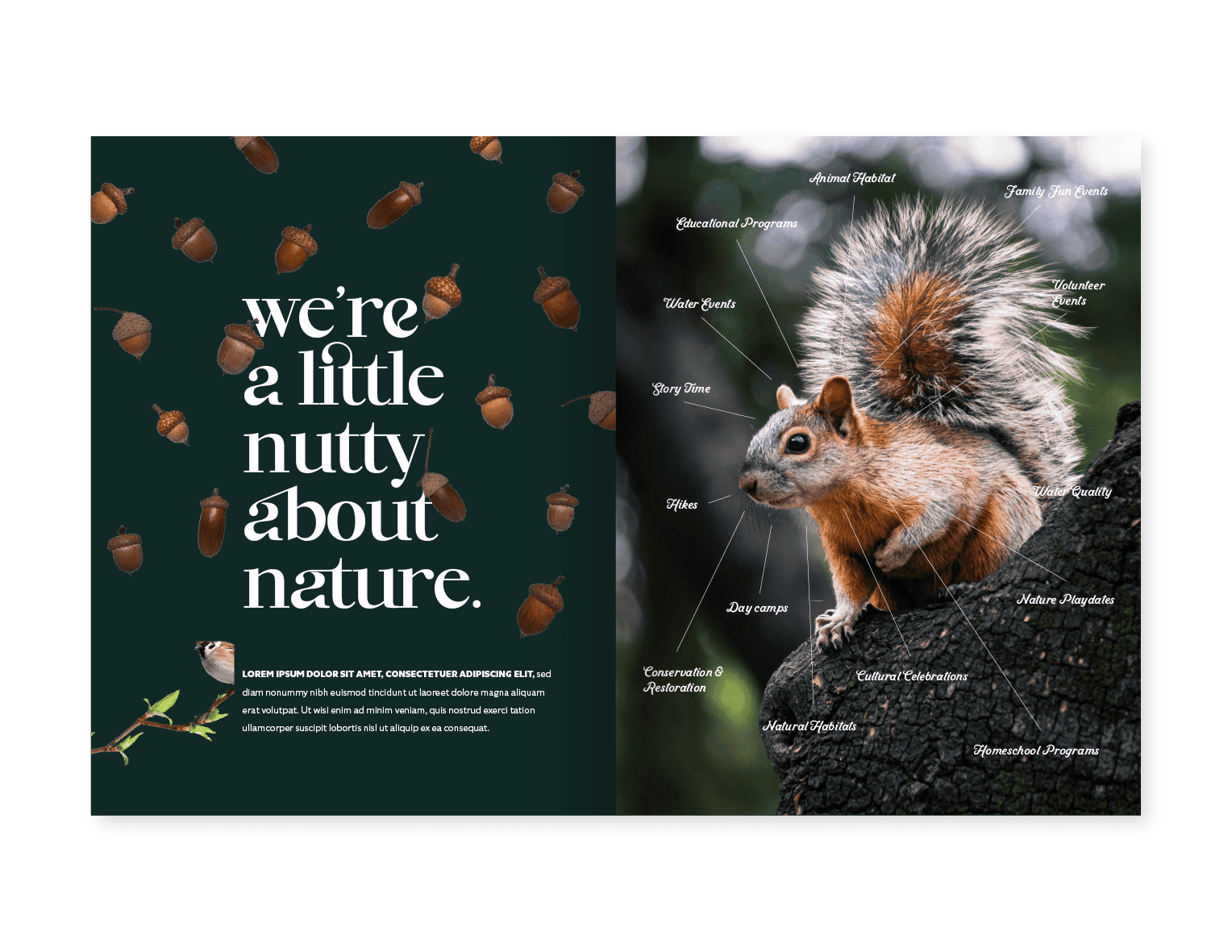
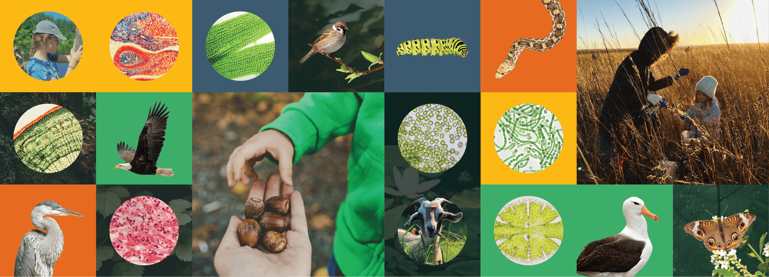
An organic blend of rich textural background images, intriguing animals, plants, and environments, plus magnified science photography create a sense of colorful discovery and playfulness for the brand look.
Iconography
Evolving iconography.
To ensure readability, the iconography developed for PCC is simple, bright, and balanced. We took a page from Mother Nature’s book and reduced the icons to their simplest form, resulting in engaging geometric shapes and vivid color applications.
Campaign
A good-natured campaign.
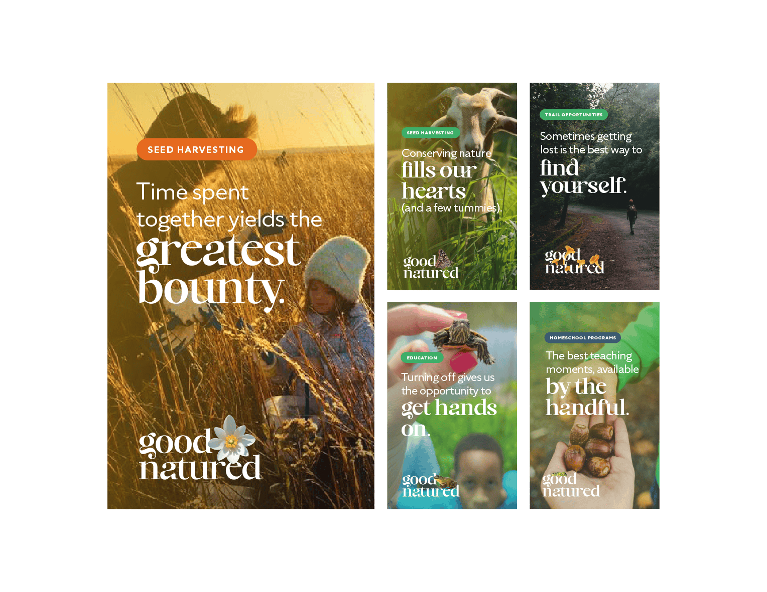
The Good Natured brand campaign reminds audiences (both internal and external) that being in nature, learning about nature, and protecting nature feels good. It positions PCC as the organization that provides feel-good nature experiences for everyone, whether it’s playing golf, attending a seminar about butterflies, or pitching in to protect the prairie.
Wearables
Flora and fauna fans.
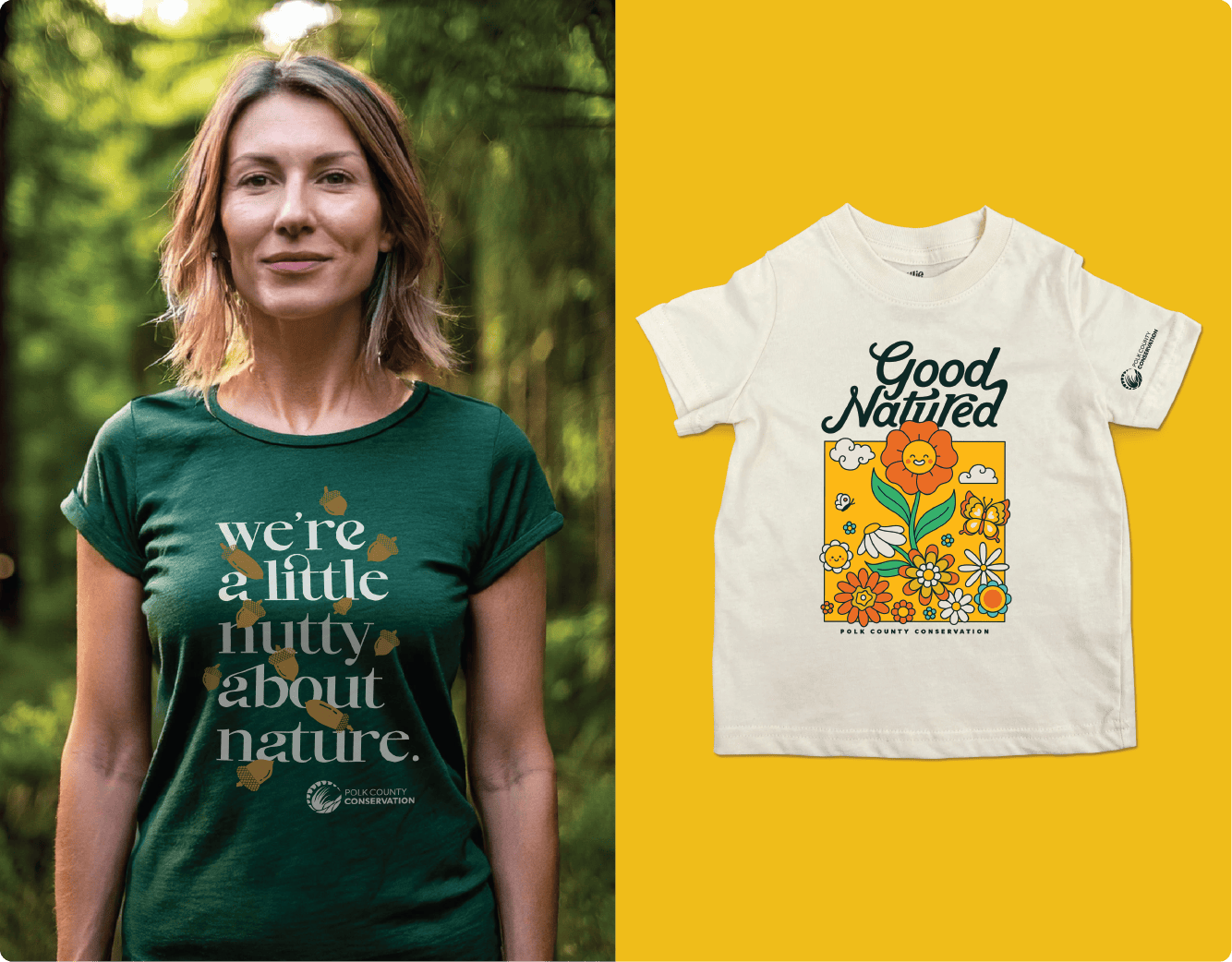
Whether you’re on the trail, attending a day camp, or volunteering your time to protect the land and its wildlife, PCC employees and fans can represent the organization’s mission playfully and purposefully.
Deliverables
Efficiency meets education.
A critical part of PCC’s mission is to provide education to park visitors. We created versatile, functional, and beautiful templates for in-park signage, presentations, and fact sheets so employees would feel prepared and empowered to carry out their important mission.
